How to Build a Website That Converts on Every Device Your Customers Actually Use
Right now, someone in Gulfport is sitting in their truck at a red light, searching for your service on their phone. They tap your website. It takes six seconds to load. The text is too small to read. The phone number isn’t clickable. They hit the back button and call the next result instead. That entire interaction took less than ten seconds, and you lost a customer you’ll never know about. According to Google’s consumer behavior data, over 70 percent of local service searches happen on mobile devices, and 61 percent of users who have a bad mobile experience will never come back to that site, according to Google’s mobile benchmarks research. If you want to build a website that converts, it has to work flawlessly on a phone, because that’s where the majority of people trying to find you are searching.
Your Customers Are Not Sitting at Desks
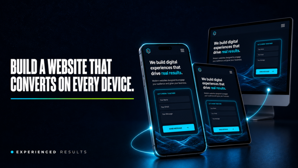
The image most business owners have when they think about their website is someone sitting at a computer, browsing carefully through pages. That hasn’t been reality for years. Your customers are searching from job sites, parking lots, waiting rooms, and kitchen tables. They’re using phones with screens smaller than a paperback book, connected to cell networks that are slower than your office Wi-Fi.
Google’s own data confirms it: more than half of all web traffic worldwide comes from mobile devices. For local service businesses on the Gulf Coast, that number is even higher because the people searching for “AC repair near me” or “pressure washing in Ocean Springs” are almost always on their phones, often in the moment they need the service.
When your website was built, it was probably designed on a desktop monitor. It looked great at 1920 pixels wide. But shrink that down to 390 pixels on an iPhone, and everything breaks. Menus overlap. Images stretch off screen. Buttons are too small to tap. Text runs edge to edge with no breathing room. The experience goes from professional to frustrating in the time it takes to load.
Page Speed Is the First Test You’re Failing
Before a visitor reads a single word on your site, they’ve already made a judgment based on how fast it loaded. Google’s research shows that 53 percent of mobile visitors abandon a page that takes longer than three seconds to load. Three seconds. That’s not enough time to read this sentence.
Most small business websites take five to eight seconds to load on a mobile connection. The reasons are predictable: uncompressed images that are 3MB each when they should be 200KB, bloated plugins loading scripts on every page, cheap shared hosting that slows down during peak hours, and code that was never optimized for performance.
The fix isn’t complicated, but it requires intentional work. Images need to be properly sized and compressed before upload. Professional photography matters here because professionally shot images come properly formatted and sized, while phone photos and stock images are often massive files that choke mobile connections. Every plugin needs to justify its existence. Hosting needs to be fast enough to serve pages in under two seconds. And the code itself needs to be clean, with nothing loading that isn’t absolutely necessary.
Research from Portent found that website conversion rates drop by an average of 4.42% with each additional second of load time. Speed isn’t just about user experience. Google uses page speed as a ranking factor, especially for mobile searches. A slow site doesn’t just lose visitors, it ranks lower, which means fewer people find it in the first place. You can’t build a website that converts if Google won’t show it to anyone.
Thumb Friendly Navigation and Click to Call
Watch someone use a website on their phone and you’ll notice something immediately: they’re navigating with one thumb. Not a mouse pointer with pixel-perfect accuracy. A thumb. On a screen that’s barely five inches wide.
Every button, link, and menu item on your mobile site needs to be large enough to tap accurately with a thumb. Apple’s guidelines say tap targets should be at least 44 pixels. Google says 48 pixels. Most small business websites have buttons that are 30 pixels or smaller, crammed next to other small buttons with no spacing between them. The result is frustration, accidental taps, and visitors who give up.
The most important tap target on your entire site is your phone number. If someone is on your mobile site and ready to call, tapping your phone number should immediately open their dialer. That means your phone number needs to be a clickable link, visible without scrolling, and large enough to tap without zooming in. A phone number displayed as plain text that can’t be tapped is the mobile equivalent of hanging up on a customer who’s trying to reach you.
Your main navigation menu should collapse into a clean hamburger menu on mobile. The menu items inside should be spaced far enough apart that tapping “Services” doesn’t accidentally open “About.” And your primary call to action, whether that’s “Get a Free Estimate” or “Book Now” or “Call Us,” should be visible on every page without scrolling.
Mobile Forms That People Actually Complete
If you want to build a website that converts, your contact form needs to work perfectly on a phone. Most don’t. They’re designed for desktop screens with wide input fields, multiple columns, and dropdown menus that are impossible to navigate on a small touchscreen.
A mobile optimized form follows a few simple rules. Single column layout only. Large input fields with plenty of padding so they’re easy to tap into. The correct keyboard type for each field, meaning a number pad for phone numbers, an email keyboard for email addresses, and a regular keyboard for names. Labels above the fields, not inside them as placeholder text that disappears when the user starts typing. And the absolute minimum number of fields necessary to capture the lead.
Every additional field you add to a form reduces completion rates. On mobile, the drop-off is even steeper because typing on a phone is slower and more error prone than typing on a keyboard. If you’re asking for name, email, phone, address, service type, preferred date, budget range, and a message, you’re going to lose most people before they finish. Name, phone, and “what do you need?” is enough to start the conversation. You can get the rest on the follow-up call.
Responsive Images That Build Trust on Any Screen
Images are the heaviest elements on most web pages, and they’re the first thing that breaks on mobile. An image that looks sharp and properly sized on a desktop monitor can appear stretched, cropped awkwardly, or painfully slow to load on a phone.
Responsive images adapt to the screen they’re being viewed on. The browser loads a smaller version for phones and a larger version for desktops, so mobile visitors aren’t downloading a 2000-pixel-wide image to display it at 390 pixels. This saves bandwidth, speeds up load times, and keeps the visual quality consistent across devices.
This is where professional photography makes a real difference. Stock photos are generic and often poorly optimized. Professional photos of your actual business, your team, your completed work, and your location are shot at the right resolution, exported at web-optimized sizes, and look sharp on every device. A photo of your crew in front of a completed job in D’Iberville tells a phone user “this is a real business that does real work nearby.” A stock photo of a smiling man in a hard hat tells them nothing.
Video content follows the same principle. A short walkthrough of a completed project or a 30-second introduction from you builds more trust than any amount of text. But the video needs to load fast, play without buffering, and display properly on a vertical phone screen. Professional videography ensures the content is shot and exported specifically for web delivery across all devices.
Build a Website That Converts with Mobile Booking and Instant Contact
The entire purpose of your mobile site is to make it effortless for someone to take the next step. Whether that’s calling you, filling out a form, booking an appointment, or getting directions, the path from “I found this business” to “I’m contacting this business” should take fewer than three taps.
For service businesses on the Gulf Coast, the most effective mobile conversion tools are click-to-call buttons that stay visible as the user scrolls, a simplified contact form that takes under 30 seconds to complete, an embedded booking calendar where customers can pick a date and time without calling, and a Google Maps link that opens directions with one tap.
Each of those tools works together to capture leads at different stages of readiness. The customer who’s ready right now taps the phone button. The customer who wants to think about it fills out the form. The customer who knows what they need books the appointment directly. A website that only offers one way to make contact loses everyone who prefers a different method.
The businesses booking the most jobs aren’t the ones with the fanciest websites. They’re the ones who build a website that converts by making it dead simple to take action on a phone at 9 PM on a Tuesday night. That’s when your customers are searching. That’s when they’re ready. And if your site can’t close that moment, someone else’s will.
Testing Your Mobile Site Takes Five Minutes
Pull out your phone right now and visit your own website. Don’t use Wi-Fi, use your cell data so you experience what your customers experience. Time how long it takes to load. Try to find your phone number and tap it. Fill out your contact form using only your thumbs. Navigate to your services page. Look at your images and see if they’re sharp or blurry. Try to book an appointment or request a quote.
If any of those steps feel slow, confusing, or frustrating, your customers feel it too. The difference is they don’t push through it. They leave.
Google offers a free tool called PageSpeed Insights that grades your mobile performance and tells you exactly what’s slowing your site down. Run your URL through it and look at the mobile score. Anything below 50 is critical. Between 50 and 80 needs work. Above 80 means your technical foundation is solid.
For a complete breakdown of the specific problems that drive visitors away from your site, including mobile issues, we’ve covered the six most common failures in detail. Every one of them hits harder on mobile than on desktop because mobile users have less patience, less screen space, and more alternatives one tap away.
Frequently Asked Questions
Mobile first means your website is designed for phone screens before desktop screens. The layout, navigation, images, and content are built to work perfectly on a small touchscreen first, then scaled up for larger screens. This is the opposite of how most small business websites are built. Mobile first ensures the experience most of your visitors actually have is the best version of your site, not a compressed version of something designed for a monitor.
Under three seconds on a mobile connection. Google’s data shows that 53 percent of mobile visitors leave if a page takes longer than three seconds. The ideal target is under two seconds. You can test your current speed using Google PageSpeed Insights, which gives you a score and specific recommendations for improvement.
No. Separate mobile websites are outdated and create SEO problems because Google has to index two versions of your site. What you need is a responsive website that automatically adapts its layout to whatever screen size the visitor is using. One website, one URL, one set of content that displays differently on phones, tablets, and desktops.
Your phone number needs to be wrapped in a link using the tel: protocol. When someone taps it on their phone, it opens the dialer with your number pre-filled. If your phone number is just plain text, users have to memorize it, switch apps, and type it in manually. Most won’t bother. Your web developer can make this change in minutes.
Yes. Google uses mobile first indexing, which means it primarily uses the mobile version of your site to determine your search rankings. If your mobile site is slow, difficult to navigate, or has content that doesn’t display properly on phones, your rankings suffer across all devices. Page speed, mobile usability, and Core Web Vitals are all confirmed ranking factors.
Professional photographers deliver images that are properly sized and optimized for web use, which means they load faster on mobile connections. They also look sharp at any screen size because they’re shot at the right resolution and exported with web delivery in mind. Stock photos and phone camera photos are often oversized files that slow down your site and look blurry or awkwardly cropped on mobile screens.

Stop Losing Leads
Every month without a system is a month you're paying for leads you'll never see.
Find out exactly what it's costing you. 60 seconds, zero obligation.