What Your Website Contact Page Should Actually Say (Most Get This Wrong)
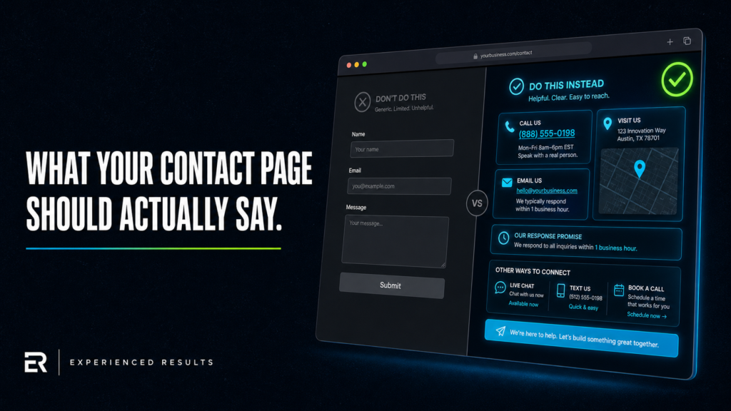
Here’s what most contact pages look like: a form, an address, maybe a phone number, and a Google Map embed. That’s it. The business owner checked the box, figured the page was done, and moved on. Meanwhile, potential customers land on that page ready to reach out, see nothing that makes them feel confident about making contact, and leave. They don’t fill out the form. They don’t call. They just go back to the search results and click the next business. If your website contact page looks like a placeholder, it’s performing like one.
Your Website Contact Page Is a Decision Page
Most business owners treat their contact page like an afterthought. It’s the last page they build, the one that gets the least attention, and the one they almost never revisit after launch. That’s a problem, because your contact page isn’t just a page with your information on it. It’s a decision page. Usability research from the Nielsen Norman Group shows that contact pages are among the top three most visited pages on service business websites, and their design directly impacts whether visitors convert or leave.
Think about when someone reaches your contact page. They’ve already looked at your services. They’ve read your reviews, scanned your about page, maybe checked your pricing. They’re at the end of the line. This is the moment where they either pick up the phone, fill out the form, and become a lead, or they hesitate, get uncomfortable, and leave.
What makes them hesitate? Uncertainty. They don’t know what happens after they submit the form. They don’t know when you’ll respond. They don’t know if calling is better than emailing. They don’t know if you’re even going to see their message. A good contact page eliminates all of that uncertainty before the visitor has to wonder about any of it.
Businesses that invest in their contact pages see conversion increases of 30% to 50%. That’s not a guess. That’s what happens when you remove friction from the one page where the entire goal is getting someone to take action. Every question they have to ask themselves that you didn’t answer is friction. Every second they spend wondering is a second closer to leaving.
What Information Actually Belongs on a Contact Page
A contact form by itself isn’t a website contact page. It’s a component on a contact page. Here’s what the full page should include.
A Clickable Phone Number
Over 60% of local business website traffic comes from mobile devices. If your phone number isn’t a clickable tel: link, you’re forcing mobile visitors to memorize your number, switch to their dialer, and type it in manually. Most won’t bother. A clickable phone number takes one tap. Make the number large, make it prominent, and make sure it works on every device. Test it on your own phone right now. If it doesn’t dial when you tap it, fix it today.
Your Hours of Operation
If a potential customer in Gulfport finds your website at 7 PM on a Tuesday and your contact page doesn’t show your hours, they have no idea if calling right now will reach a person or a voicemail. That uncertainty is enough to make them try someone else. List your hours clearly. If you have different hours for phone support and walk-in visits, list both. If you have seasonal hours, note that.
A Response Time Promise
This is the single most impactful thing you can add to a contact page that most businesses never include. A simple line that says “We respond to all inquiries within 2 business hours” or “You’ll hear back from us by the next business day” sets an expectation. It tells the visitor that their message won’t disappear into a void. It tells them that a real person on the other end is going to see it and respond. That single sentence can be the difference between a submitted form and an abandoned page. Research from Salesforce found that 80% of customers say the experience a company provides is as important as its products or services, and setting clear response time expectations is one of the simplest ways to improve that experience.
Multiple Contact Methods
Some people prefer phone calls. Some prefer email. Some prefer text messages. Some prefer filling out a form because they’re reaching out at 11 PM and don’t want to call. If you only offer one contact method, you’re losing everyone who prefers a different one. Include your phone number (clickable), your email address, your contact form, and if you accept text messages, say so. The more ways you make yourself available, the fewer excuses someone has not to reach out.
A Short FAQ Section
If you’re a service business on the Gulf Coast, you get the same five questions from every new customer. “Do you offer free estimates?” “What areas do you serve?” “Are you licensed and insured?” “How quickly can you get here?” “Do you offer financing?” Answer those questions right on the contact page. Every question you answer before they have to ask it removes a barrier to contact. They came to the page with objections. Eliminate the objections before they reach the form.
A Map That Shows Your Service Area
If you’re a service-area business (you go to the customer, not the other way around), an embedded Google Map with your service area marked is more useful than a pin on your office address. A homeowner in Gautier wants to know if you serve Gautier. Show them. If you have a physical location that customers visit, pin your exact address and make sure the directions work. Either way, the map answers “do you serve my area?” without the visitor having to ask.
Design Principles That Increase Conversions
What your contact page says matters, but how it’s structured matters just as much. These aren’t aesthetic preferences. These are patterns that measurably affect whether people complete the action.
Keep the form short. According to Google’s form design guidelines, every field you add to a contact form decreases completion rates. Data from HubSpot found that reducing form fields from four to three can improve conversion rates by nearly 50%. Name, email or phone, and a message field. That’s the baseline. If you absolutely need to ask about the type of service they need, make it a dropdown, not a required text field. If you’re asking for their address, their budget, their timeline, and their mother’s maiden name, you’re running an interrogation, not a contact form. Get the lead first. Qualify later.
Put the phone number above the fold. “Above the fold” means visible without scrolling. When someone lands on your contact page on their phone, the first thing they should see is how to call you. If they have to scroll past a paragraph of text and a map to find your number, some of them won’t scroll at all.
Use a clear headline. “Contact Us” is fine. It’s clear and nobody has to think about it. Don’t get creative with “Let’s Start a Conversation” or “Begin Your Journey.” The visitor knows what page they’re on. Confirm it, add a line about what happens when they reach out, and get out of the way.
Make the submit button say something specific. “Submit” is generic. “Request Your Free Estimate” is specific. “Send My Message” is personal. The button text is the last thing someone reads before they commit to taking action. Make it confirm what they’re getting, not just what they’re doing.
What Not to Put on Your Contact Page
Just as important as what belongs on the page is what doesn’t. These are common additions that actually hurt performance.
Don’t put a CAPTCHA on the form unless you have a serious spam problem. CAPTCHAs add friction. Every additional step between “I want to contact this business” and “Done” loses people. If spam is an issue, use a honeypot field (a hidden field that bots fill out but humans don’t) or a simple question like “What is 2 + 3?” Both are less disruptive than making a visitor click on every image that contains a traffic light.
Don’t require a phone number AND an email. Let the visitor choose their preferred contact method. Some people don’t want to give out their phone number to a business they haven’t talked to yet. If you make it required, they’ll either enter a fake number or abandon the form entirely. Make one of them required and the other optional.
Don’t embed a chatbot that pops up over the contact form. If someone navigated specifically to your contact page, they’ve already decided they want to reach out. A chatbot that covers the form is like a store employee stepping in front of the register while you’re trying to check out. If you use a chatbot, make sure it doesn’t interfere with the primary conversion action on the page.
Don’t hide the page. Your contact page should be in your main navigation, visible on every page of your site. Don’t bury it in a footer link or make visitors hunt for it. If your website isn’t generating leads, check how many clicks it takes to reach your contact page from any given page on the site. The answer should be one.
The Trust Gap Most Contact Pages Create
Here’s something that doesn’t get talked about enough. When a visitor lands on a website contact page that has nothing but a form and an address, it creates a trust gap. The visitor is being asked to hand over their personal information (name, email, phone number) to a business that hasn’t demonstrated any reciprocal vulnerability. They don’t see a real person. They don’t see a commitment. They see a form that might as well be a black hole.
The businesses that close this trust gap do it with small, specific signals. A photo of the actual person or team who will receive the message. A line that says “Your message goes directly to Mike, our owner, not a call center.” A note that says “We never share your information with third parties.” These signals are tiny, but they make the visitor feel like they’re reaching out to a real human being, not filling out a ticket.
If your business serves the Gulf Coast, lean into that. “Locally owned in Ocean Springs since 2014” on the contact page reminds the visitor that you’re a neighbor, not a faceless company. That’s a trust signal that national competitors can never match.
Look at your entire website through the eyes of someone who’s never heard of you. They found you on Google, clicked through a few pages, and ended up on your contact page. Everything they’ve seen up to this point either built trust or didn’t. The contact page is where all of that trust gets tested. If the page feels thin, impersonal, or uncertain, all the good work your other pages did gets wasted at the finish line.
Building a Website Contact Page That Converts on Every Device
A website contact page that works on desktop but falls apart on mobile is losing you money right now. More than half your visitors are on their phones, and a form that’s hard to fill out on a small screen is a form that doesn’t get filled out.
Test your contact page on your actual phone. Not a browser simulator, your real phone. Can you tap the phone number and have it dial? Are the form fields large enough to tap without zooming? Does the keyboard that appears match the field type (number pad for phone fields, @ keyboard for email fields)? Can you complete the form with one thumb while standing in line at the grocery store? If any of those answers is no, your mobile contact experience needs work.
Make sure the page loads fast. A contact page with a massive embedded map, three background images, and an auto-playing video is going to load slowly on mobile data. A page that takes more than three seconds to load loses over half its visitors before they even see the form. Keep the page lean. The map can lazy-load below the fold. The essential elements (phone number, form, hours) should appear instantly.
Test the form submission. Fill it out yourself and submit it. Does the confirmation message make sense? Does the email notification actually arrive? Is the email formatted so you can respond quickly? You’d be surprised how many business websites have contact forms that don’t actually work, that send submissions to an email nobody checks, or that show a generic “Thank you” with no indication of what happens next. The confirmation should say “We received your message and will respond within [timeframe].” Specific. Reassuring. Done.
Frequently Asked Questions
Three to five maximum for most service businesses. Name, email or phone (let them choose which to provide), and a message field are the essentials. If you need to know the type of service, add a dropdown. Every field beyond the essentials decreases your completion rate. Get the lead first and qualify them during your follow-up.
Both. Some people prefer to email directly from their own email client rather than filling out a form, especially on mobile. Display your email address as a clickable mailto: link alongside your form. You’re not choosing between the two, you’re giving visitors the option to use whichever method they’re most comfortable with.
Yes. A response time promise eliminates one of the biggest reasons people don’t fill out contact forms: the fear that their message will disappear and nobody will ever respond. Something as simple as “We respond within 2 business hours” sets an expectation and makes the visitor feel confident that a real person will see their inquiry. The key is that you actually have to meet that promise. Don’t write “2 hours” if your average response time is two days.
It should confirm that the message was received, tell them when to expect a response, and tell them who’s going to respond. “Thanks, [Name]. We received your message and Mike will get back to you within one business day. If you need immediate help, call us at [phone number].” That’s a confirmation that builds confidence. “Thank you for your submission” is a dead end that leaves the visitor wondering if anything actually happened.
Only if your social media profiles are active and you actually respond to messages there. If your last Facebook post was eight months ago, linking to it on your contact page hurts more than it helps. It tells the visitor you don’t maintain your online presence. If your social media is active and you use it as a legitimate communication channel, include it. But never position social media as a replacement for a phone number and email. Those are your primary contact methods. Social is supplemental.
Set up goal tracking in Google Analytics for your contact form submissions. Track your form completion rate (how many people who land on the page actually submit the form). Industry average for contact page conversion is between 1% and 5%. If you’re below 1%, your page has a friction problem. Check your form length, your page speed, your mobile experience, and whether you’re answering the common questions visitors have before they feel comfortable reaching out.

Stop Losing Leads
Every month without a system is a month you're paying for leads you'll never see.
Find out exactly what it's costing you. 60 seconds, zero obligation.